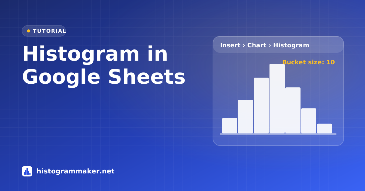
Short on time? Paste your numbers into our free histogram maker and download a finished chart in under a minute, with no software and no formulas.
Make the histogram
Google SheetsInsert›Chart›Setup›Chart type›Histogram chart
- Put your data in one column, with a header in the first row (for example “Score”).
- Select the column.
- Click Insert › Chart. Google Sheets may suggest a different chart type at first.
- In the Chart editor, open the Setup tab and choose Histogram chart from the Chart type list.
Change the bucket size
Google SheetsChart editor›Customize›Histogram›Bucket size
Sheets calls bins buckets. Open the Customize tab and expand the Histogram section:
- Bucket size sets the width of each bar, for example 10 for buckets 0–10, 10–20, 20–30.
- Outlier percentile stops a few extreme values from stretching the buckets. Values beyond the chosen percentile are still counted, but they are added to the first or last bucket.
- Show item dividers draws a thin line between the individual values stacked in each bar.
Add a chart title and axis titles under Customize › Chart & axis titles, and change the bar color under Series.
Build a frequency table too
The chart doesn’t show the counts as a table. To get one, list your bin upper limits in a column (for example C2:C7) and enter =FREQUENCY(A2:A100, C2:C7) next to them. Like Excel, FREQUENCY counts values up to and including each limit. For bins that include their lower edge, use COUNTIFS:
=COUNTIFS(A$2:A$100, ">="&B2, A$2:A$100, "<"&C2)
where B2 and C2 are the lower and upper edges of the bin.
Common problems
- Histogram chart isn’t suggested: pick it manually from the Chart type list in the Setup tab.
- You can’t choose where the first bucket starts. Sheets lets you set the bucket size but not its starting point. If you need exact bins such as 45–55, 55–65, use a column chart of a COUNTIFS table, or set the start directly in our histogram maker.
- Numbers stored as text are skipped. Use Format › Number › Number on the column.
A faster alternative
Copy the column from Google Sheets and paste it into the histogram maker. You get full control of the bins (including the start value), a frequency table you can paste back into Sheets, summary statistics and a normal curve, and downloads as PNG, SVG or PDF up to 4K.
Other tutorials
- Histogram in Excel: Built-in chart, Analysis ToolPak and FREQUENCY.
- Histogram on a TI-84: STAT PLOT, Xscl and ZoomStat.
- Histogram in Desmos: histogram(), bin width, box and dot plots.
- Histogram in Python: Matplotlib, pandas, seaborn and NumPy.