Histograms vs. Bar Charts: Key Differences and When to Use Each

When visualizing data, choosing the right type of chart is crucial for clear communication and accurate analysis. Two commonly used charts are histograms and bar charts. While they may look similar at first glance, they serve different purposes and interpret distinct types of data. Let’s dive into the key differences between histograms and bar charts and explore when to use each one.
What is a Histogram?
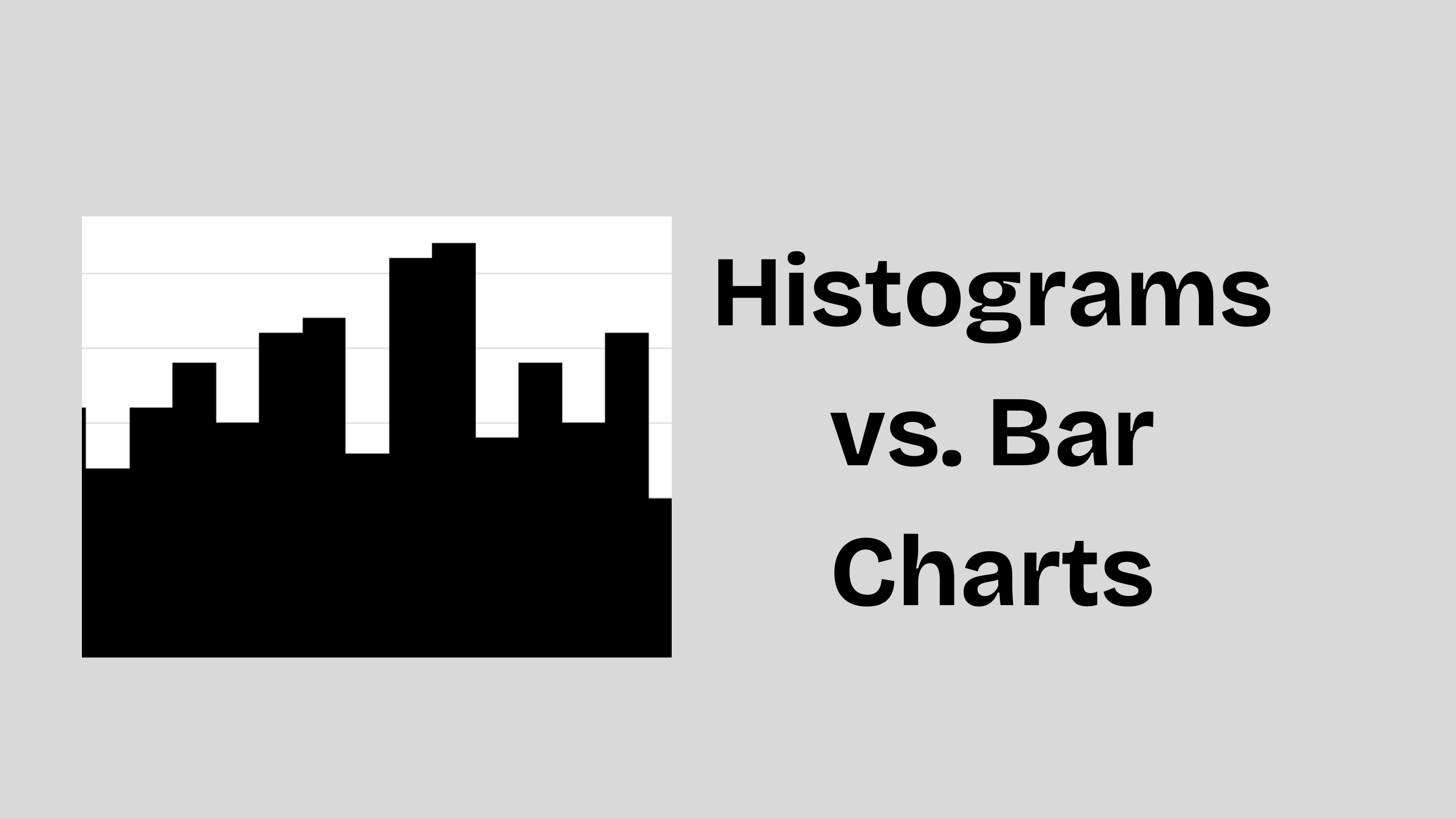
A histogram is a graphical representation of the distribution of numerical data. It groups data into continuous intervals called bins and displays the frequency of data points within each bin. The bars in a histogram touch each other, emphasizing that the data is continuous.
Key Characteristics of Histograms:
- Displays continuous data.
- Bars touch each other to show data continuity.
- Each bar represents a range of values (bin).
- Useful for analyzing data distribution and patterns.
Example Use Cases for Histograms:
- Analyzing test scores of students.
- Understanding the age distribution of a population.
- Identifying patterns in customer purchase amounts.
What is a Bar Chart?
A bar chart represents categorical data with rectangular bars. Each bar corresponds to a category, and the length of the bar reflects the frequency or value of that category. Bars in a bar chart are separated to highlight the distinction between categories.
Key Characteristics of Bar Charts:
- Displays categorical data.
- Bars are separated to show distinct categories.
- Each bar represents a specific category.
- Useful for comparing discrete groups or categories.
Example Use Cases for Bar Charts:
- Comparing product sales across different regions.
- Displaying survey responses by category.
- Showing the number of customers by membership type.
Key Differences Between Histograms and Bar Charts
| Feature | Histogram | Bar Chart |
|---|---|---|
| Data Type | Continuous (numerical ranges) | Categorical (distinct groups) |
| Bar Spacing | No gaps (bars touch) | Gaps between bars |
| X-Axis Values | Intervals or bins (ranges) | Categories or labels |
| Purpose | Show distribution and frequency | Compare categories or groups |
| Examples | Age ranges, height distribution | Favorite colors, product sales |
Use a Histogram When:
- You want to understand the distribution of numerical data.
- Your data is continuous (e.g., age, time, weight).
- You need to identify patterns like skewness, outliers, or central tendencies.
Use a Bar Chart When:
- You want to compare categories or groups.
- Your data is categorical (e.g., product names, cities).
- You need to display count-based information for distinct groups.
Choosing the Right Chart
Selecting the appropriate chart depends on the nature of your data and the insights you want to convey. If you're working with continuous data, a histogram reveals trends and distributions. If you're analyzing categorical data, a bar chart helps compare different groups clearly.