Short on time? Paste your numbers into our free histogram maker and download a finished chart in under a minute, with no software and no formulas.
Step 1: Enter your data as a list
In a new expression line, type a name, an equals sign and your values in square brackets:
L = [52, 58, 61, 64, 64, 67, 69, 70, 71, 73, 75, 75, 76, 78, 80, 82]
You can also add a table (the + button › table), type the values in the first column (x₁), and refer to that column as x_1.
Step 2: Draw the histogram
On the next line, type:
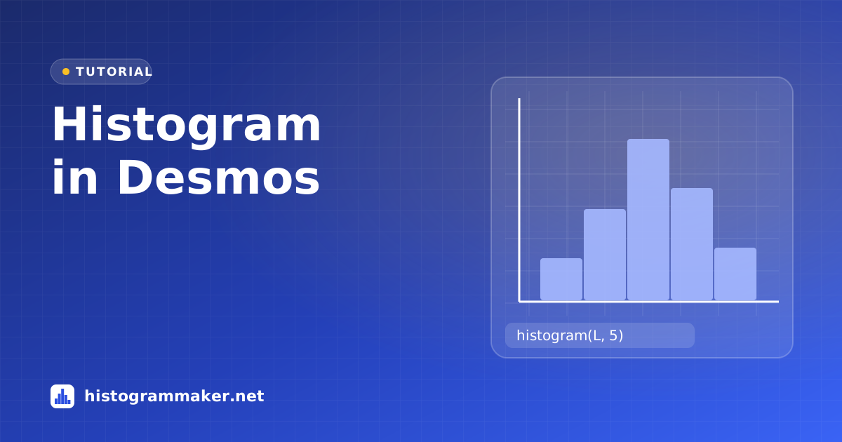
histogram(L, 5)
The second number is the bin width. If you leave it out, Desmos uses a bin width of 1, which is usually too narrow for scores or measurements. Then zoom the graph to fit the bars (use the zoom-fit button or adjust the axes in the wrench menu).
Step 3: Adjust the settings
DesmosClick the histogram’s color icon›Bin alignment / Count · Relative · Density
Click the colored icon next to the histogram expression to open its options:
- Bin alignment: by default, bins are centered on multiples of the bin width (so with width 5, a bin runs from 57.5 to 62.5). Choose Left to put the bin edges on multiples of the width instead (55–60, 60–65), which matches most textbooks.
- Count / Relative / Density: Count shows raw frequencies; Relative scales the bars so their heights add up to 1; Density scales them so the total area is 1.
- Change the color and opacity to compare two overlapping histograms.
Box plots and dot plots in Desmos
The same list works with boxplot(L) for a box-and-whisker plot and dotplot(L) for a dot plot. To compute statistics, type mean(L), median(L), stdev(L) (sample) or stdevp(L) (population), quartile(L, 1) and quartile(L, 3).
Tips
- Choose a bin width that gives roughly 5–15 bars.
- If bars look shifted by half a bin, switch the bin alignment to Left.
- Desmos histograms don’t list the counts. For a frequency table and summary statistics, paste the same values into the histogram maker.
Want the five-number summary checked? Use the five-number summary calculator. Desmos’s quartile method may differ from your textbook’s, and the calculator shows all three common methods side by side.
Other tutorials
- Histogram in Excel: Built-in chart, Analysis ToolPak and FREQUENCY.
- Histogram in Google Sheets: Chart editor, bucket size and outliers.
- Histogram on a TI-84: STAT PLOT, Xscl and ZoomStat.
- Histogram in Python: Matplotlib, pandas, seaborn and NumPy.